


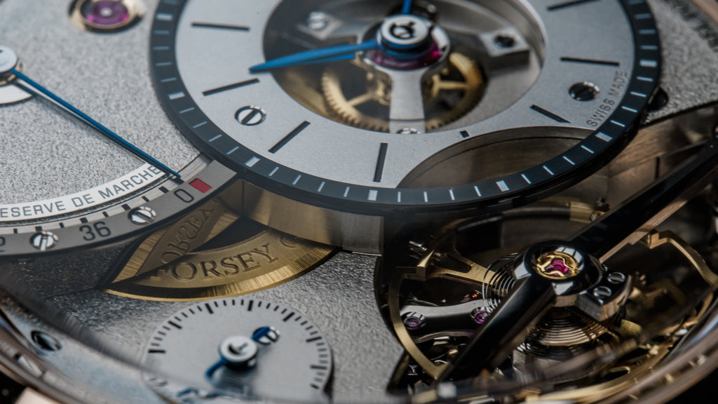
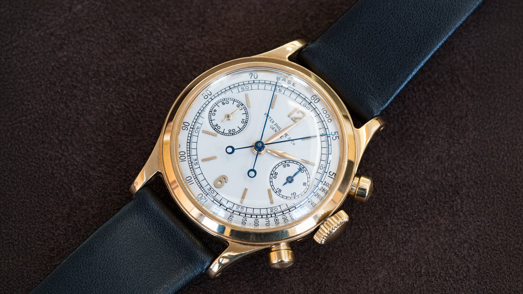


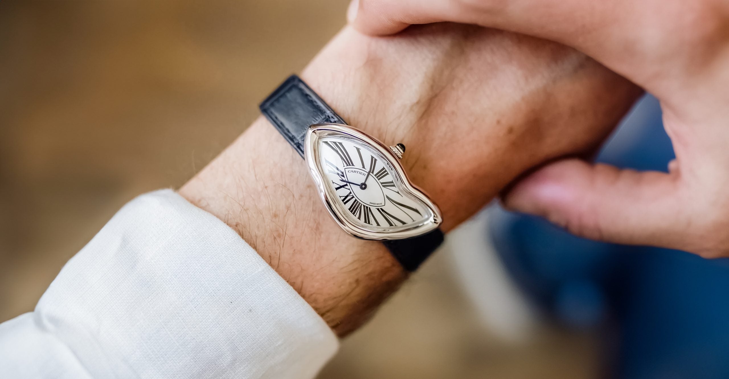
NSO Cartier Crash, White Gold
Sporting a Crash is the closest thing in watches to walking around holding a Salvador Dali above your head. But sporting an NSO (Cartier’s new program to create custom orders for their best clients) Crash is like having Dali make that painting just for you. The allure of a tailored watch is strong, so strong that there have been no shortage of these appearing on the market. This is a process that can take years to just design, let alone the war chest needed to build up the kind of rapport with Cartier that would allow for a bespoke creation. And I have to applaud that someone went through all that trouble, spend history, and time to create an NSO crash that looks completely factory.

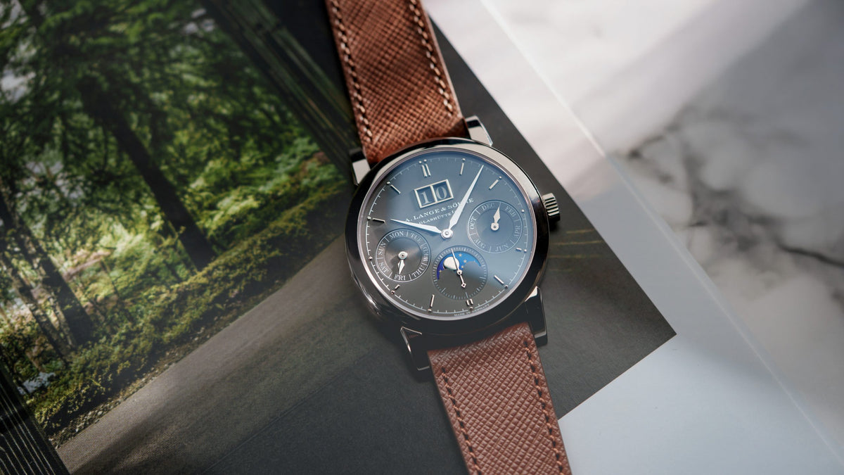
This is a white gold case and white opaline dial, blued steel hands, and nothing more. The NSO program was already in full swing when this watch was made, 2021. Perhaps, then, this spec is a bit of a counter-positioning to the proliferation of insane green, salmon, or even mother of pearl (which does exist) dials we’re seeing with increasing frequency. Just how far an NSO client can push or pull the fundamental design is not well-defined. Everything still has to be approved by the high priests at Cartier and combinations deemed ugly or garish will not see the light of day. I know of several friends of ours who’ve had designs rejected, and that’s probably a good thing. When this hit the desk, I have to wonder if Cartier’s design department just asked, ‘Did they send it in black and white by mistake?’

There’s a kind of restrained power in executing such a simple design with an N of 1. It’s like getting Gordon Ramsay to make you chicken and rice with no sauce, or having Michael Bay make a movie with no special effects: it shows a different character of their ability, distraction-less. The question to ask is whether any of this is actually a good idea long term for Cartier. Consider the 1994 Hong Kong LE Crash, which a friend of Hairspring recently picked up from finds (that’s pink gold, red numerals, LE of 40). Beautiful, but what I like most about the HK LE is that it’s what Cartier themselves wanted to make in the 90s. If Cartier had asked their clients in the 90s individually, we’d have a piece unique leopard print dial. Cartier knows more about design than you or I do. Take for example the green NSO that went through Phillips earlier this month, I know a few people who work for broader Cartier who hate it. Now, not everything needs to be universally appealing. But Cartier shouldn’t be Suit Supply either, it can be taken too far. And I think this watch gets that, despite being tailored.

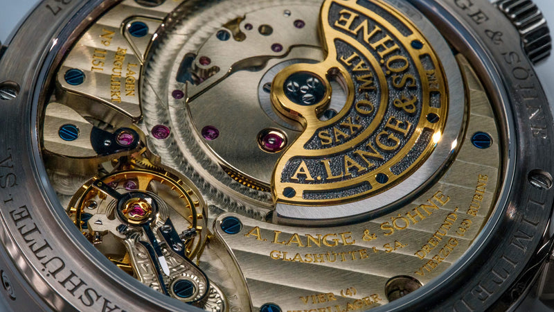
This one is from just a few years ago, it looks nothing more than very lightly worn. The case is showing no signs of big knocks or even hard wear. It comes with all the goodies from a well-regarded Belgian retailer.
0 comments
Write a Comment