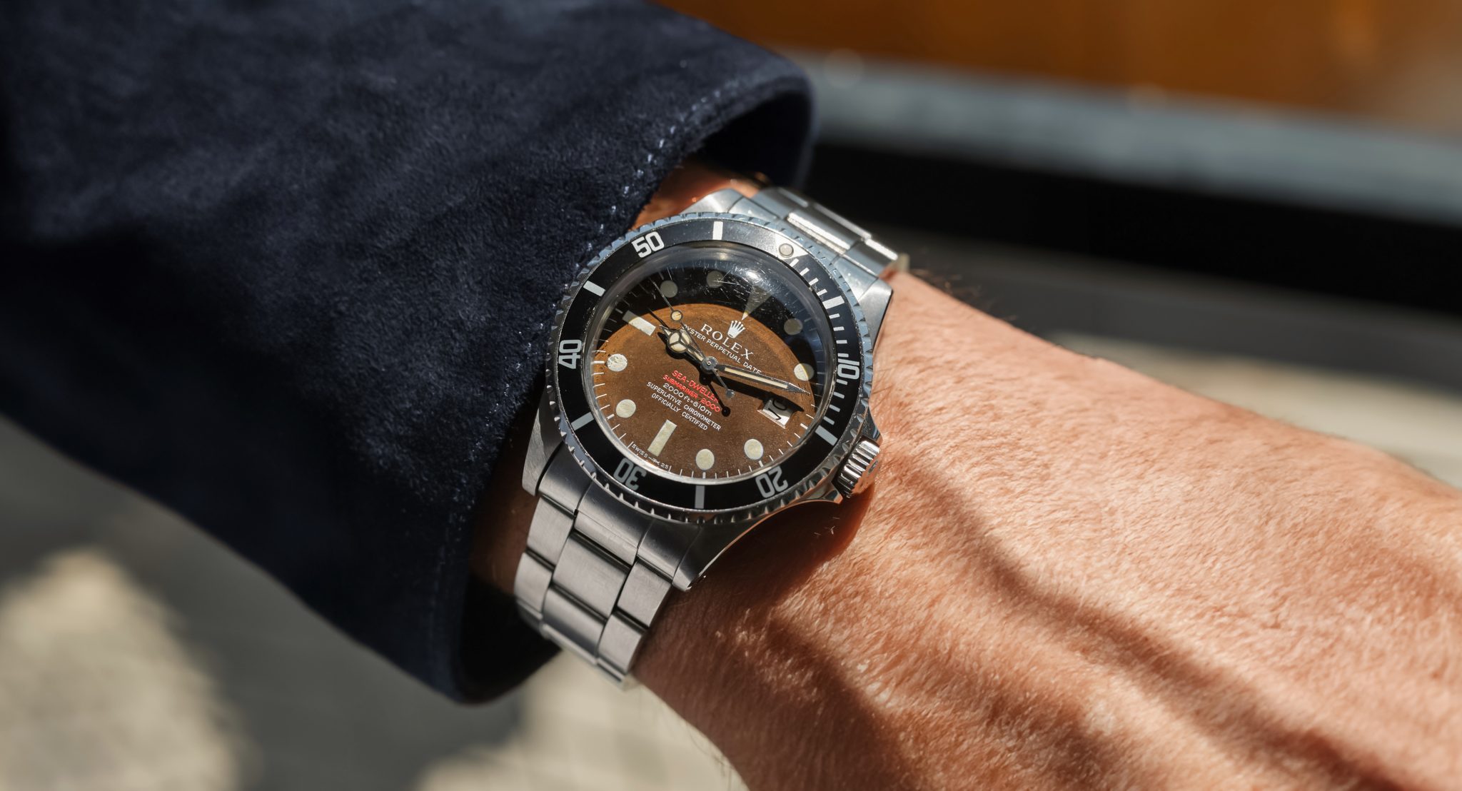
Value Prop: 16550 Rolex Explorer II Black Dial
If you adhere to the modern aphorism which states that condition is the new rarity, you’ll understand my total excitement here. Perfection in vintage watches really doesn’t exist. Therefore, what I like personally are honest examples with integrity and cohesive character. More than that, however, I have weak spot for value. And in Rolex sports watches, it’s hard to find better value than vintage Explorer IIs . . .even with the recent surge in interest.

The 16550 updated the classic 1655 design by adding a fully independent jumping hour hand to track secondary timezones. It was also the first EII to introduce a sapphire crystal. Production ran from 1985 to 1989, with fewer pieces being produced than the references on either side of it. For these reasons, many consider it the transitional reference. These few pieces had many variations through the production run. Hands and surrounds changed materials. Small variations often occurred in the ‘Superlative Chronometer; Official Certified’ text. Small hands exits. Fat and thin (or often called square vs thin) font bezels exist in the reference. This is the latter, thought to be produced toward the end of production and toward the 16570. Dials varied by rail (or not), white or cream, and the even black we see here.
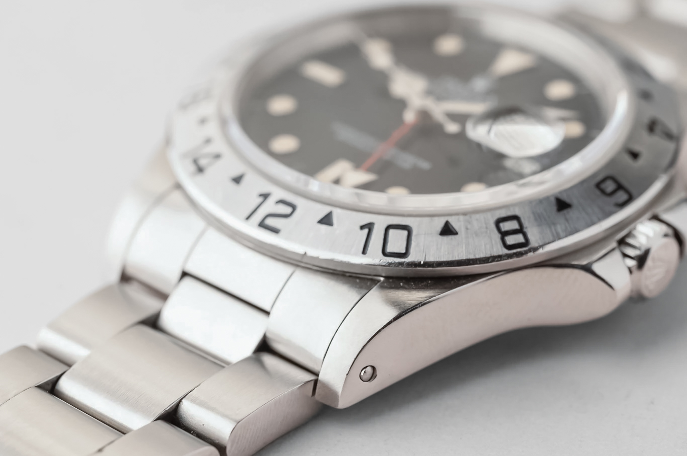
Typically, collectors will tend to give slight favor to the polar EII and go a bit mad over cream dials. That’s purely a hallmark of collective madness, with no objective measure. The good thing about that bizarre hierarchy is that black 16550s are a considerable value today. The 40mm case is perfectly proportioned, the dial is tritium, and you get dual timezones with a quickset. I can’t think of a single five-digit sports Rolex model with a comparable value proposition.

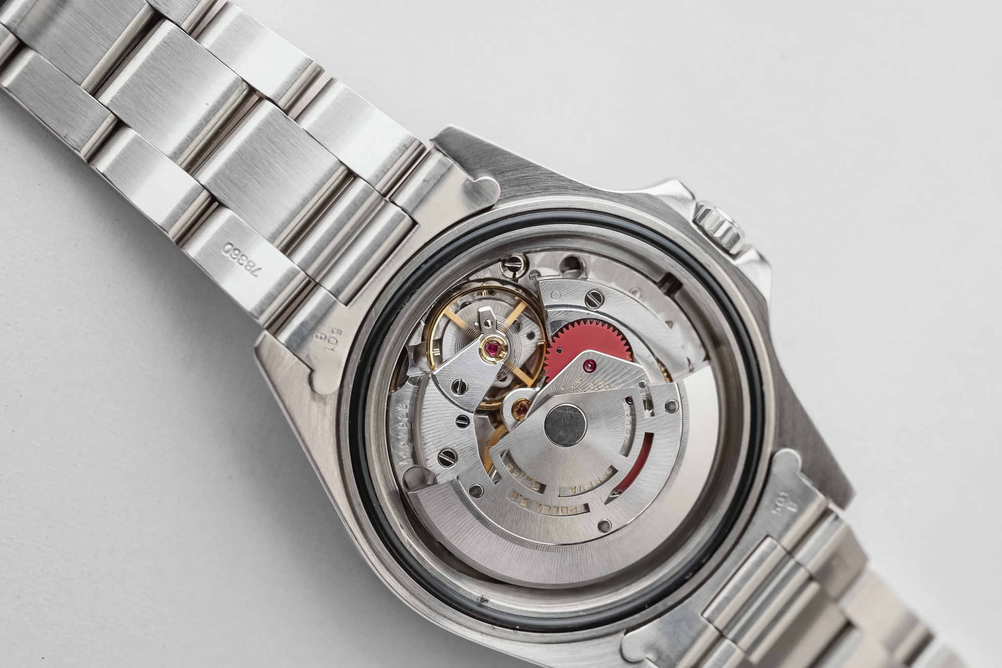
A few items of note on this particular watch. Foremost, bezel type is not quite correctly noted in the listing. To my best knowledge, this is a fat font for a 16570, which also came with a thinner font in this style. It is a thin font for the 16550; what most people call a fat font 16550 (also known as the long 1) has far more squared and fatter styled typography. Easy mistake, and the bezel is still generally considered correct (though contested on forums endlessly). Happy to be corrected if I’m off here. The dial is spectacular, an even non-spidered black with pumpkin tritium that is echoed in its handset. Small darkening is visible on the hour hand, just a bit advanced of the rest. All looking original and lovely. There is even surface wear across the case, bezel, and bracelet. Factory bevels are impressively present. It comes as a naked watch from a well-regarded small West-coast retailer.
Find this 16550 here from Grey & Patina for 13000 USD.