Blancpain Fifty Fathoms Rotomatic
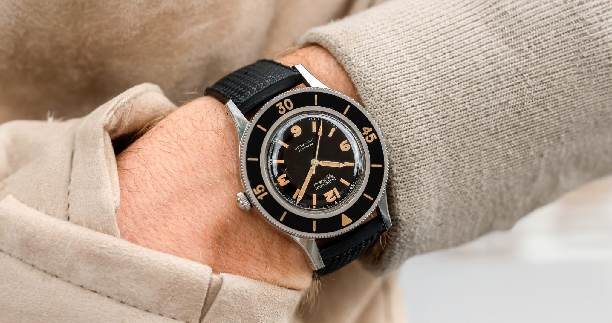
If, like many, you’ve always gazed longingly at the Fifty Fathoms only to discover they’re impossibly valuable, it might be worth a second look. Values have softened a bit. And this, the Rotomatic, is the most approachable vintage Fifty Fathoms made. The Rotomatic was the Fifty Fathoms made for the market, not military, not double signed. It is vanilla, not flavorless but just pure. But it’s no less gorgeous than any other true Fifty Fathoms and one of the purest, distraction-less divers which has ever been made.
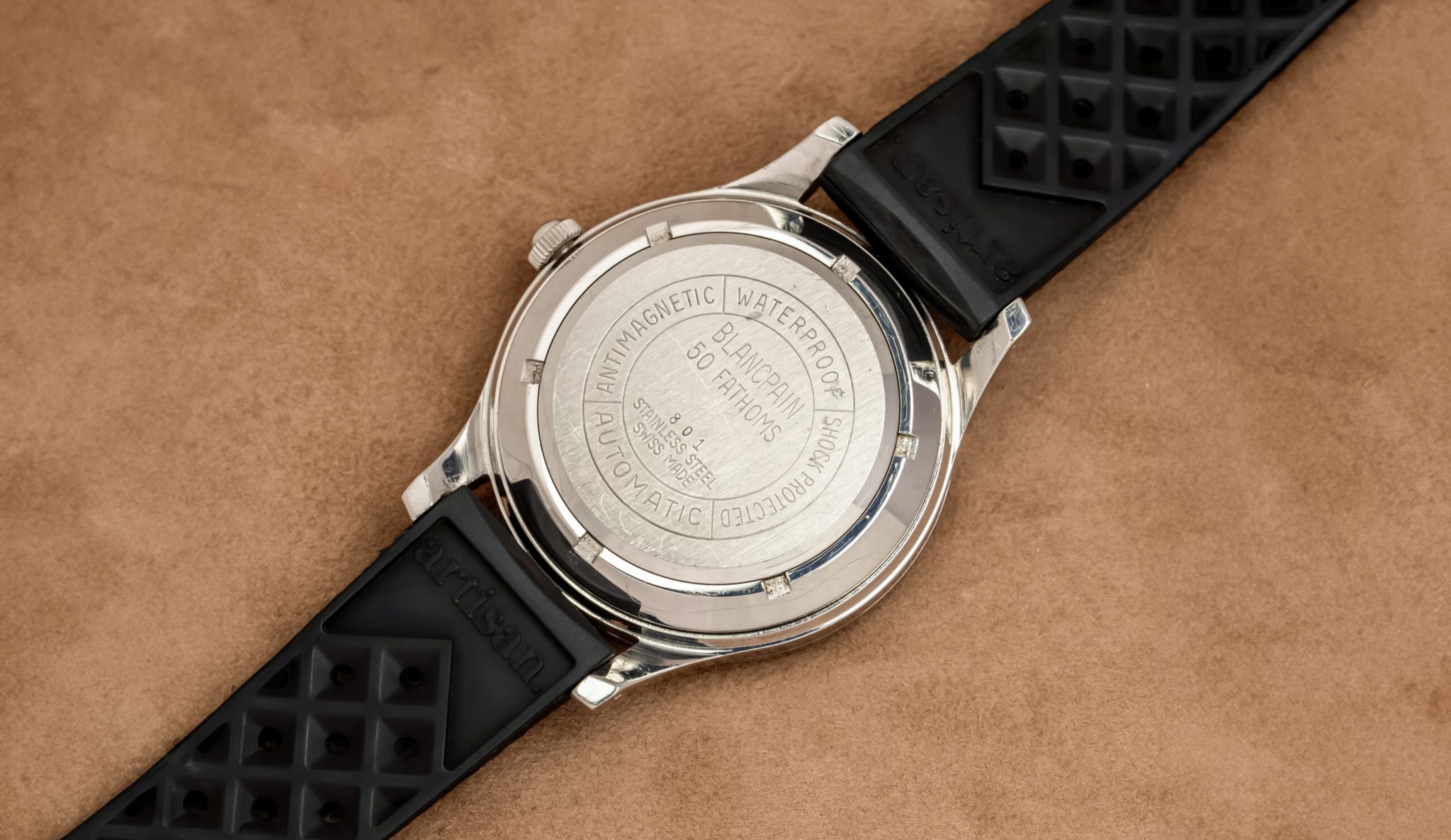
Often, some of the most beautiful watches man has yet made weren’t made to be beautiful. They were simply made to get a job finished, and that purity of purpose often results in beauty as a side effect. That’s very much the Fifty Fathoms story, developed alongside the Marine Nationale after then-CEO Jean-Jacques Fiechter nearly died in a diving accident running out of air. The resulting design spread to the combat divers of the US, Germany, Norway, Sweden, Pakistan, Hungary, and that’s not all. Shortly after military success, it was brought to the main lineup and sold through dive stores. Now, the Fifty Fathoms has encountered some hot water recently as it appears the brand-told timeline probably isn’t precisely accurate. Nonetheless, it is a deeply significant dive watch and finding any in great condition today can be considered a uncommon occasion . . .regardless of specification.
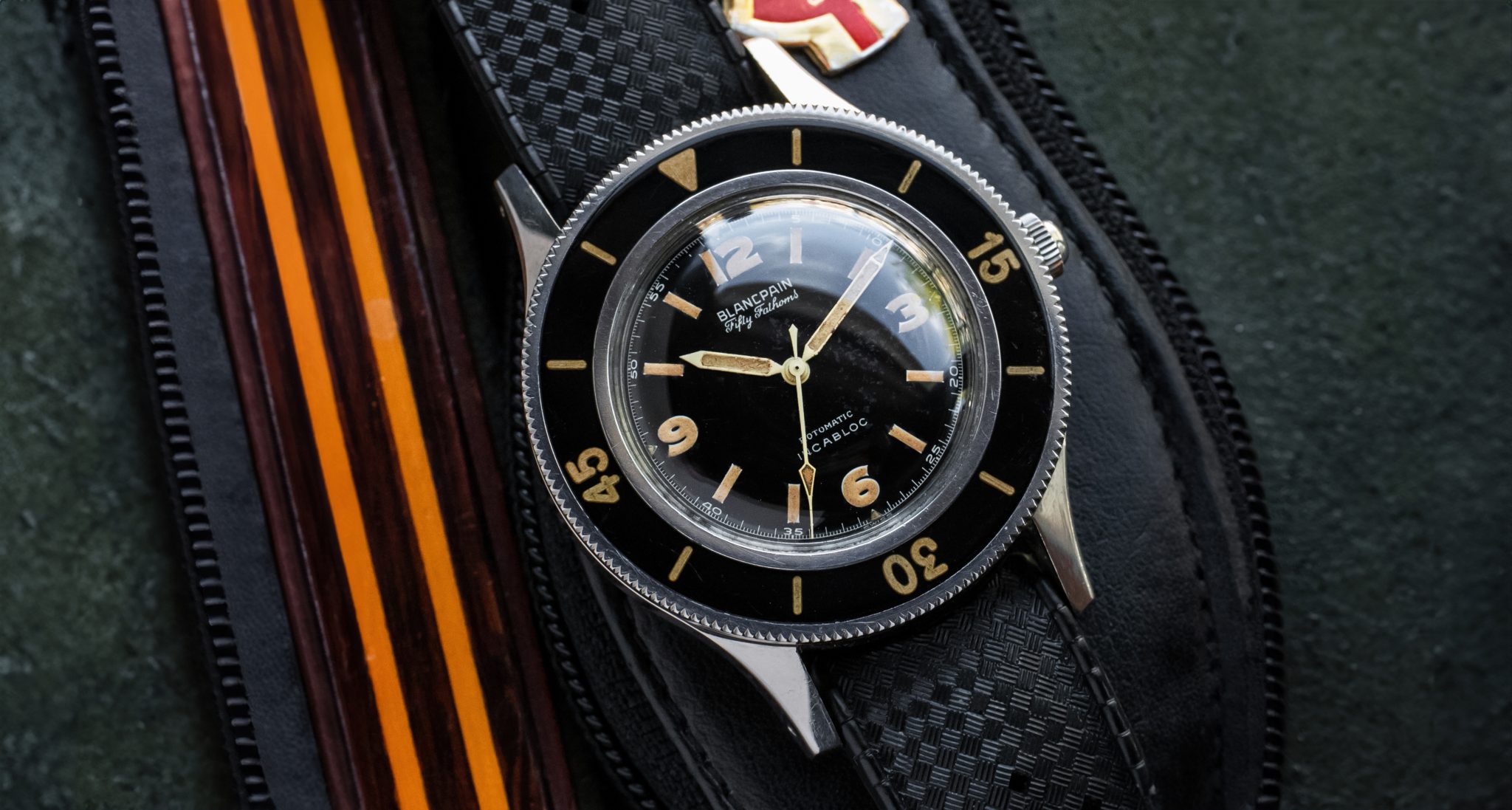
Where a Tornek Rayville is exceeding 100K still today, the more approachable Fifty Fathoms remain well under half that.These Rotomatics sport the very lovely, almost-Explorer-like dial, as they didn’t need to make room for a giant ‘No-Rad’ logo. Now, yes, that dial is radium. Personal risk tolerance is not my place to comment. But I will say, this is one of the most original and strong examples I’ve seen, with an early minute hand limed through the upper point. There’s no faulting the bezel either, 9/10 have cracks, this one doesn’t. It makes your heart go ‘Corrr’ and the geiger counter go ‘Krrr’. Plus, it’s a small font, the first iteration of the breed. It’s also roughly an order of magnitude less than the 6538, its then-contemporary peer. You kind of have to love these.
For once in my life, I can’t really make any substantial criticisms of condition here. For vintage, this is what perfect looks like. It comes from a well-regarded Dutch retailer.


